HyperCX Beat
Overview
HyperCX Beat is a solution that allows to monitor the status of the most important Key Performance Indicators (KPI) from HyperCX private clouds. It is designed to offer the most relevant information about all the critical components of HyperCX Bento in the simplest and most comprehensive way possible. It allows users to establish a proactive management of their resources which contributes to the stability and performance of the cluster.
Note
HyperCX Beat is available since HyperCX 10.6.1 release. At this moment, it is only available for private clouds.
Accessing HyperCX Beat
HyperCX Beat will be fully integrated in HyperCX Web interface soon, but on HyperCX 10.6.1 it is available only through a different URL. This URL and access credentials can be found on privileged reports recevied with the cluster, or after each upgrade.
How it works?
HyperCX Beat collects dissimilar data in real time from each components, this data is then processed and displayed in differents charts that make up each dashboard. These dashboards are built on top of grafana and they get their data from a local zabbix server using custom templates and from some custom monitoring tool developed by Virtalus. Dashboards are dinamically built and upgraded during each cluster upgrade, and they adapt to the underlying infrastructure. This means that dashboards might be different between different clusters. For example, a cluster with two datastore will show two panels for available space, one per datastore.
Understanding the data
The web interface shows in the upper left part a time selector, this allows to choose the time range to analyze a certain metric. It is also possible to select the update time of the graphs, which is recommended to be equal to or greater than 30 seconds.
There is a button dedicated to changing the view to full screen. This is of great help for dashboards visualization on a big screen. Below the time selector there are two buttons called "Resources" and "WebUI", these allow access to other more specialized dashboards. These buttons are only found in the Main Dash.
Most panels are interactive so it is possible to use the cursor to see the values of a certain metric at a given moment. In line charts, it is possible to indicate an area to be able to analyze certain time range in more detail. To do this, click on the chart area and then drag until the desired area is covered.
In charts that have a legend, it is possible to click only on those elements of interest. To select more than one, leave the "Ctrl" key pressed and click on the desired legend elements. This enables the chart to only display the data for the selected items.
Main Dashboard
This dashboard is the one that appears when accessing to HyperCX Beat. Its objective is to provide the main cluster metrics. This information provides an overview of the current state of the entire system. Although most of the panels are self descriptive, some details from the most confusing ones are provided next.
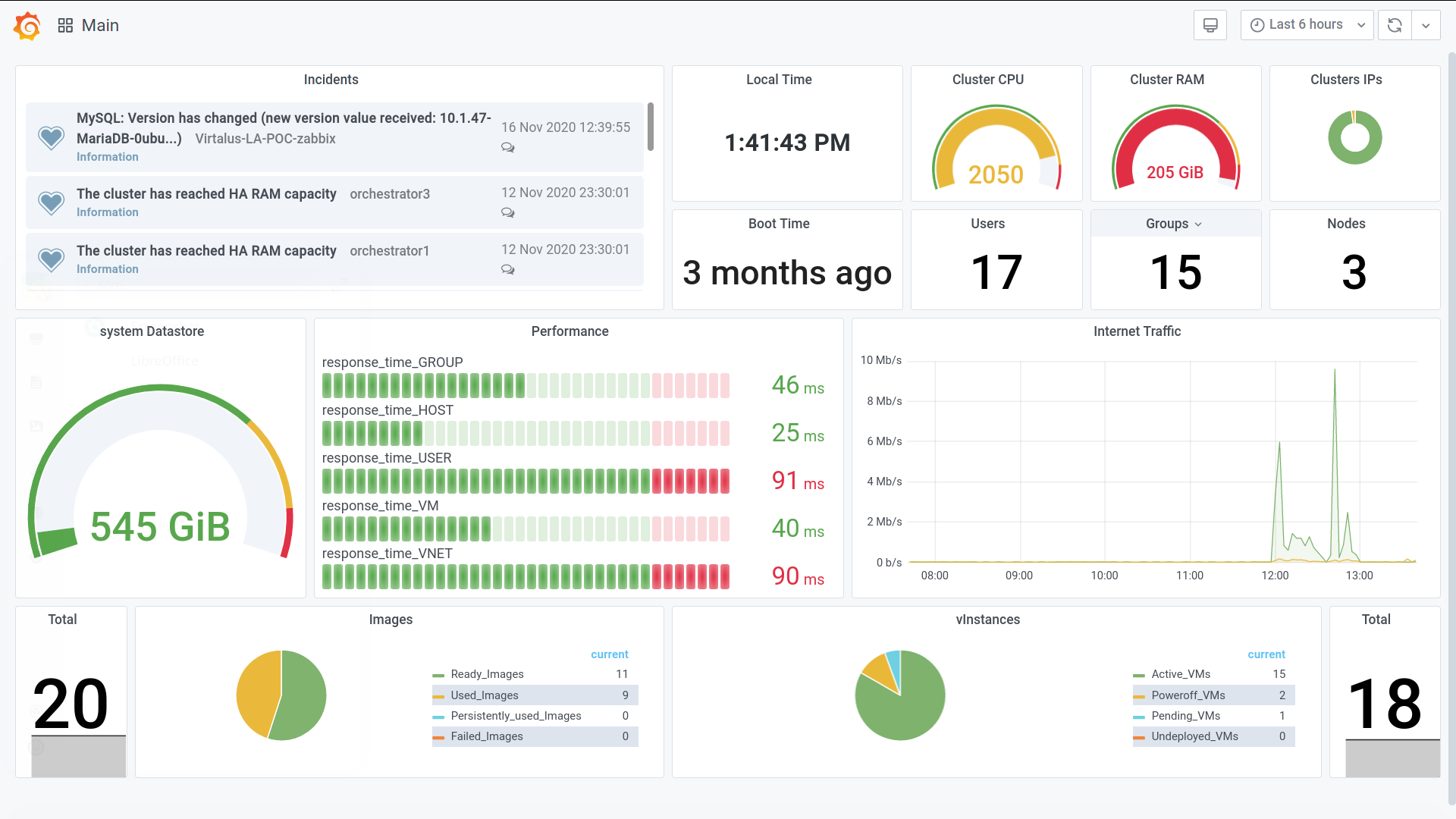
Incidents Panel
As the name suggests, this panel shows notifications of alarms that are occurring in the system. The messages have a label indicating the level of importance it has. Each message also has an icon in the form of a conversation, allowing the realization of different actions on the alarm.
Cluster CPU Panel
Shows the number of physical cores allocated in virtual instances. This metric should not be confused with virtual cores (vCPU). HyperCX Bento multiplies each physical core by 100, for example: a cluster with 20 physical cores is represented as 2000 for the cluster, this is the way it is shown in the graph.
Performance Panel
Shows the time it takes for the cluster to obtain data from various critical components. An increase in these times leads to a notable loss in overall performance. Each operation in HyperCX has a different impact, and this impact is drastically modified by the cluster's characteristics. This is the reason why performance is divided between the most common actions.
Note
Internet Traffic Panel will only work if the cluster uses the default HyperCX virtual routers.
Resources Dashboard
This dashboard is focused on showing all the relevant information about the hosted virtual instances. Some of the panels it is composed of are described below.
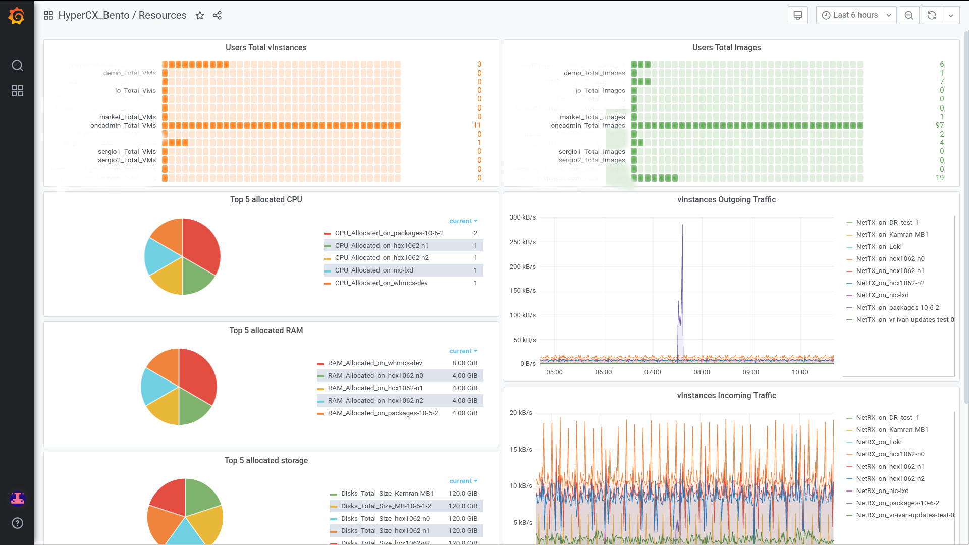
Top 5 allocated CPU Panel
Shows the 5 virtual instances with the most physical CPU cores allocated.
vInstances Incoming Traffic Panel
Shows the incoming network traffic for each virtual instance. The values observed in the graph correspond to the sum of all the incoming traffic of all the nics that the virtual instance has. These values are obtained directly from the Orchestrator API.
vInstances Outgoing Traffic Panel
Shows the outgoing network traffic for each virtual instance. The values observed in the chart correspond to the sum of all the outgoing traffic of all the nics that the virtual instance has. These values are obtained directly from the Orchestrator API.
VPN Users Traffic Panel
It shows the network traffic generated by each user when connecting to the cluster via OpenVPN. The values represented in the graph are obtained from the OpenVPN server hosted in the HyperCX virtual routers.
Note
VPN Users Traffic Panel will only work if the cluster uses the default HyperCX virtual routers.
WebUI Dashboard
This dashboard is focused on showing all the relevant information about the website on which all HyperCX Bento operations are performed.
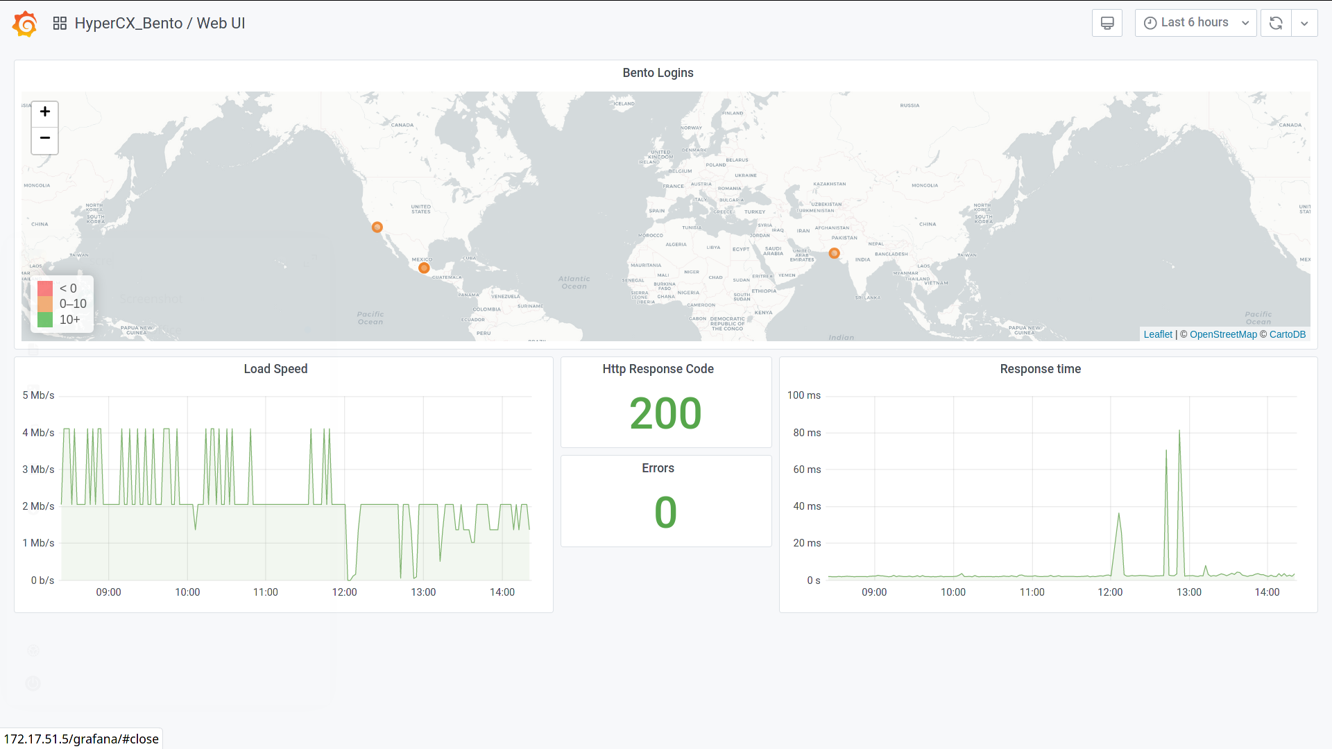
Bento Logins Panel
Shows the location from which the user is connecting to the Cluster Web Interface. It also shows the name of the user's ISP as well as the number of times they have logged in.
Note
It is important to note that the location shown on the map is relative. This information is obtained from the public IP used by the user's ISP to connect to the web portal.
Load Speed Panel
Displays the loading speed of the cluster web interface. These values are acquired generating HTTP requests from the monitoring system itself and saving all generated data from every request. Other results may be obtained if the data is acquired from another location or using differents tools.
Response time Panel
Displays the response time of the cluster web interface. These values are acquired generating HTTP requests from the monitoring system itself and saving all generated data from every request. Other results may be obtained if the data is acquired from another location or using differents tools.
HTTP Response Code Panel
Displays the HTTP response code from the cluster web interface. The value 200 indicates that the website loading is successful. In case of showing another value, the meaning of the HTTP code should be consulted.